
A Generic Brand Is a Symptom.
The Strategy Was the Problem.
Oregon Humane had the mission. They had the momentum. What they didn’t have was a brand — or a strategy — that matched the size of the work. That gap was the real brief.
Animal welfare has a sameness problem. Sad eyes, guilt trips, cheap puns. Meanwhile Oregon Humane had quietly outgrown the category — forensic centres, a Community Veterinary Hospital, a statewide merger. They weren’t a local shelter anymore. The brand just hadn’t caught up.
The smartcut: Lead with joy, not suffering. The specific, irreplaceable feeling of an animal who has chosen you. That insight didn’t just inspire a campaign. It rebuilt the brand from the ground up.
We shaped a brand that looked like who they truly were.
From a legacy identity built on duty to a brand built on joy. Same mission — completely different feeling.
Before

Generic, Duty-first.
Looked like every other humane society.
After
And launched it from the inside out.
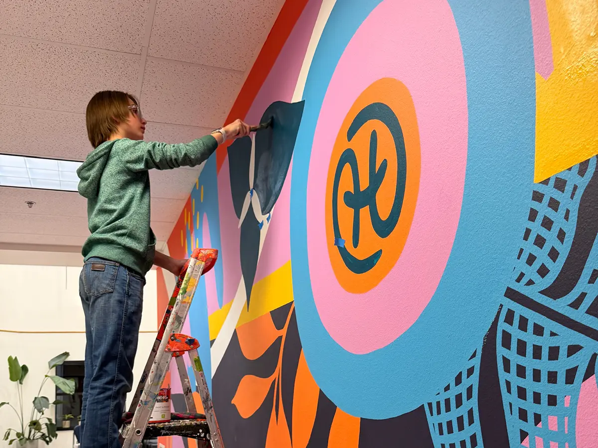
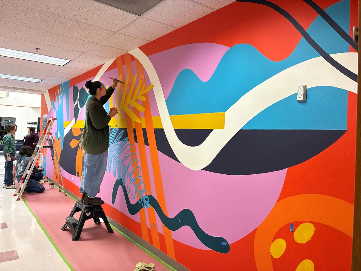
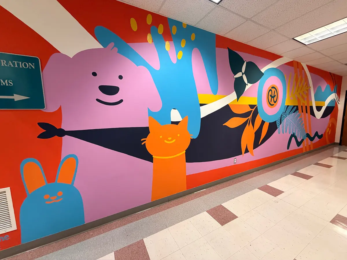
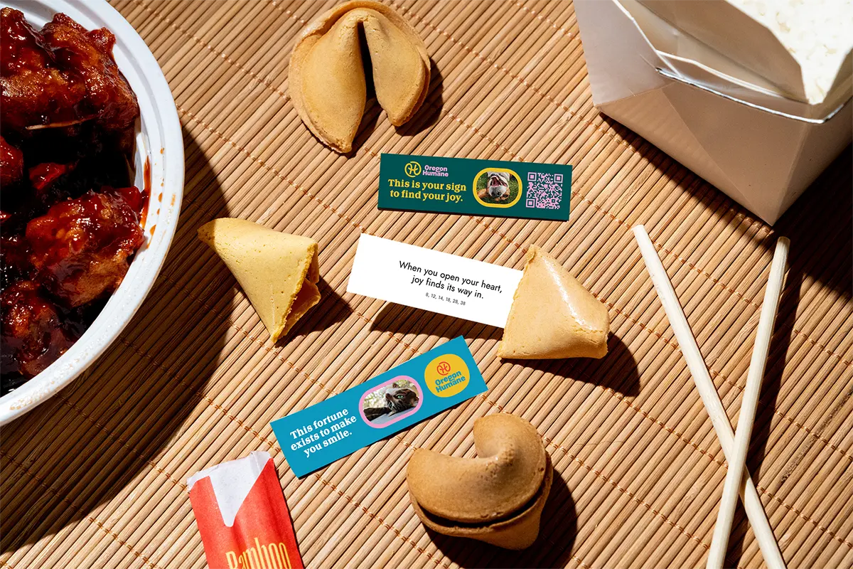
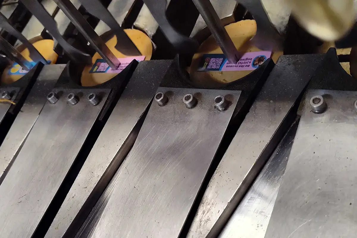
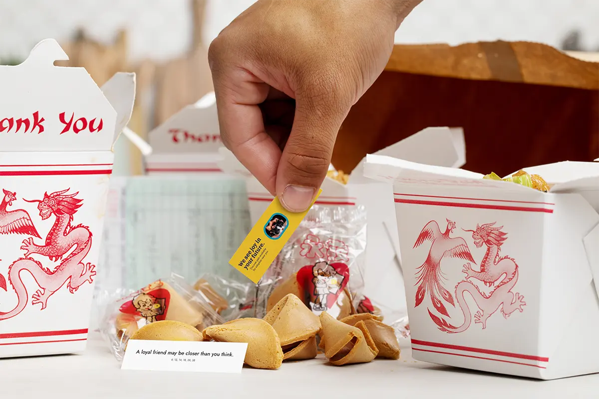
We hid joy in plain sight.
Branded fortunes were delivered at restaurants throughout the region.
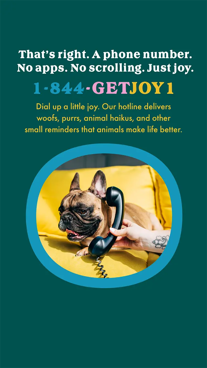
We allowed people to dial up a mood boost.
The joy hotline was designed to offer a respite to stressed Americans.

We delivered the feeling everywhere joy could strike.
The Impact
When you stop asking people to care about suffering and start giving them a reason to feel something good, the organisation becomes something entirely different. Not a rescue. A fortune waiting to happen.

Connect With Us
Reach out to our teams or subscribe to our newsletter.
Jam With Us
Don’t miss our Spotify channel for new tunes to make your day better.